 My drawn plan.
i did do some changes to it later, i switched which side the text was on so it didn't cover up the picture and it just looks better.


i liked this task as well as the first one, though i didn't learn much because i already have Photoshop on my home computer and use it on regular basis. there are some differences though, like my Photoshop isn't as simple to use and some of the things are in different places.
we had to make a magazine front cover and contents page for this task, the target audience was students at school, so basically just a school magazine. i worked on my own so i decided to use our schools colours as the 3 colours for the front cover and contents (Green, blue, white). I used a mid-shot action photo for the front cover so it looked interesting rather than just someone standing still. I tried to stick to the things that magazines should include with a check list i made which including things like:
- Masthead
- cover line
- main image
- colour/fonts
the masthead should:
- Go across the page
- reflect the magazines style
- go over/under the cover photo.
I followed all of these, the title "L.C news" goes across the page, the style of the text is aimed at my age and the writing goes over the cover photo.
the cover lines should:
- seem like special feature (Plug & lure)
- hyperbole
i don't think i followed these very well, i made the main story hyperbole with "missed it by a long shot" but i didn't have a plug or lure unless the subtitle counts "Dare to read this?"
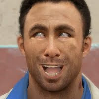
the main image should:
- big enough to fill the page
- young person (because its aimed at students)
- only use one photo
i stuck to all of these, i took about 30 pictures so i had a lot to chose from I'm happy with the one i picture though!
the colours and fonts should:
- only have 3
- reflect the audience
- title should stand out from background
- mixture of fonts (tops 3)
the only one i didn't do was change the fonts because i didn't think it looked right with different fonts.
No comments:
Post a Comment